
Redesigning Ophelia’s Books website
For this project, I did research design and analysis, content strategy and website redesign
Timeline: 2 weeks sprint
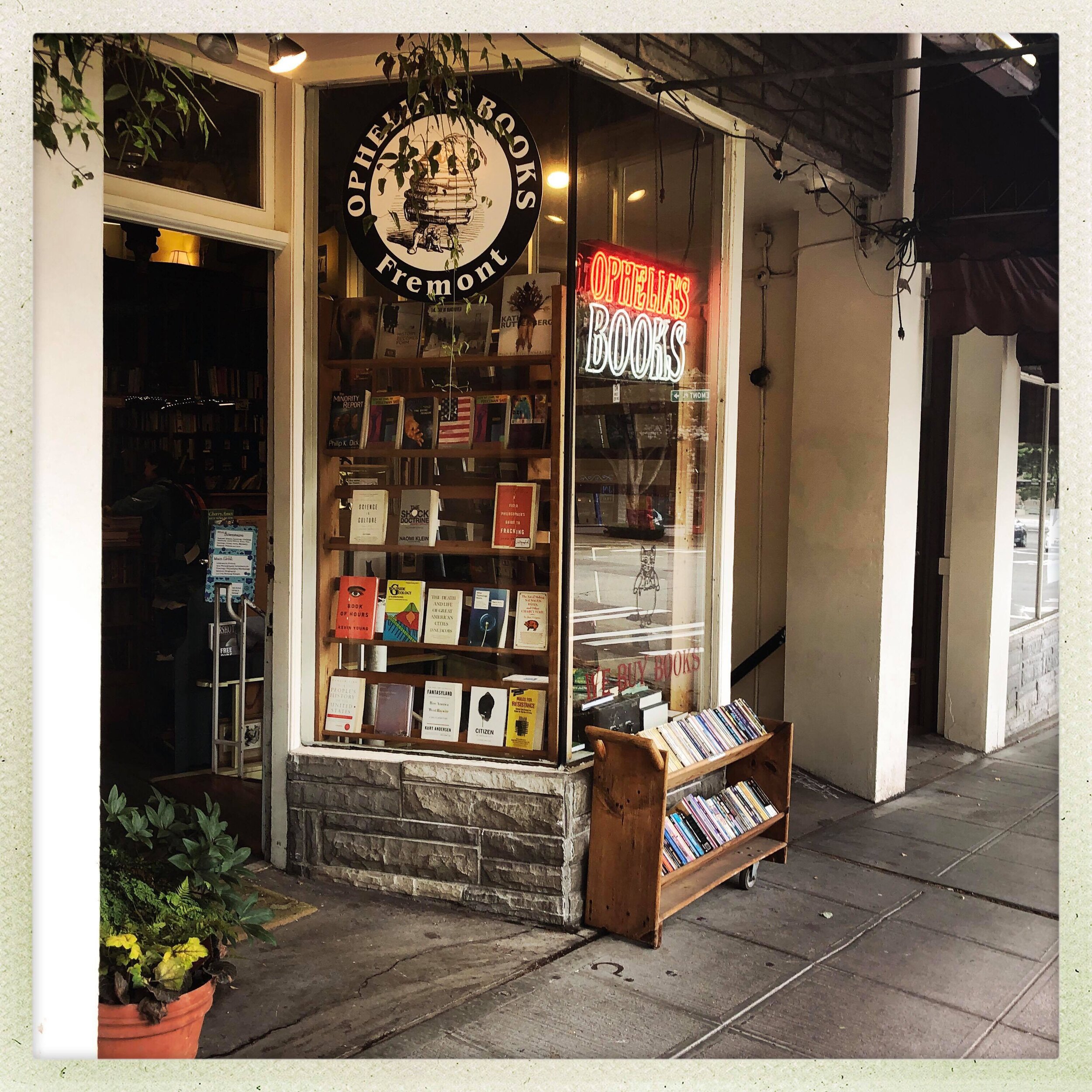
Ophelia’s Books is a small, independent, used books shop in the heart of Fremont, one of Seattle’s neighbourhoods. It has a rich history and a cat called Claudia, that helps in the shop but none of this is coming through on their website. It’s quirky, unique and comforting, a treasure trove of interesting books with a little something for everyone.
I am going to take you through the results of
the contextual inquiry, competitor analysis, interview and text analysis insights.
Following that, content strategy and designs
for the new website for Ophelia’s Books.

CURRENT WEBSITE
The current website (left), on the other hand, is dark and minimalistic with almost no information about the store apart from contact details and only two clickable elements, leading to the Facebook page and their Amazon shop.
The challenge was to redesign a website to convey the charm and quirkiness and potentially attract new customers, when they search for bookshops in the Seattle area and provide an ability to purchase books direct from the website.

Through different types of research conducted, several key insights emerged.
These insights were integrated into content strategy for the website and a problem statement:
How might I design a website that conveys the same simplicity, charm, quirkiness and atmosphere of Ophelia’s Books store?
Research rationale
Competitor analysis - to examine what similar independent bookshops do well online
Contextual inquiry - to explore the space, watch the customers browse and buy books and note any potential problems in their user experience
Interviews - to explore what customers think and how they feel about Ophelia’s Books and their experience shopping there
Text analysis of online reviews - to further examine what customers think and feel
Affinity mapping - to synthesise the interview research and help us identify
user needs and form content strategy
Closed card sorting - to determine optimal website structure
User testing - to see if the content strategy makes sense with the users
Insight 1
Independent bookshops often have websites they can’t cope with
Competitor analysis allowed me to see what Ophelia’s Books website is missing but also what small independent bookshops struggle with on their websites.
Many local independent bookshops had websites they obviously cannot cope with, showing empty pages, or content on wrong pages. Some abandoned most of their pages, and had everything on their home page.
More successful websites had nice visuals of the store and very simple site structure - 1-3 pages appropriately populated. They also offered recommendations from the staff, which added a nice touch.
Insight 2
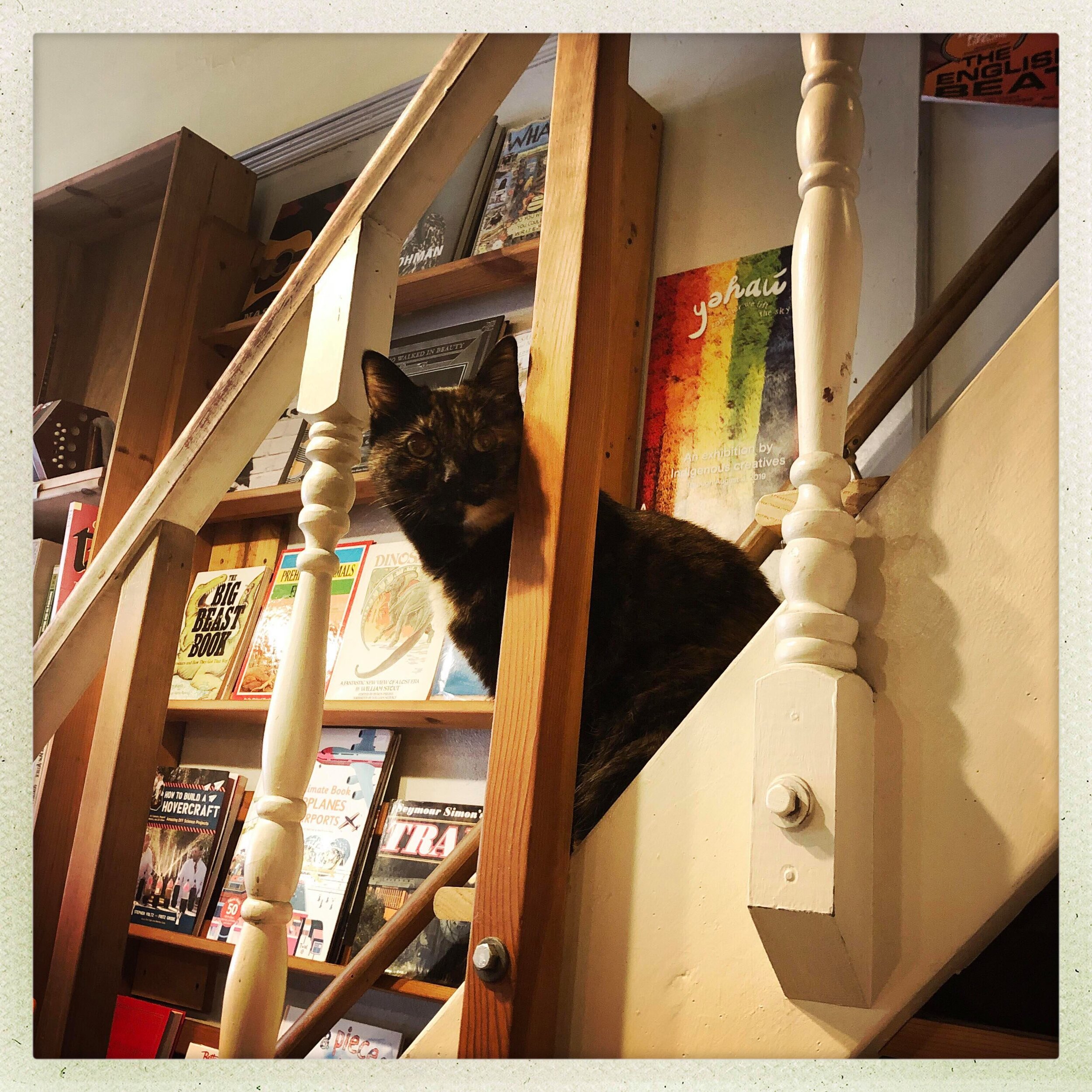
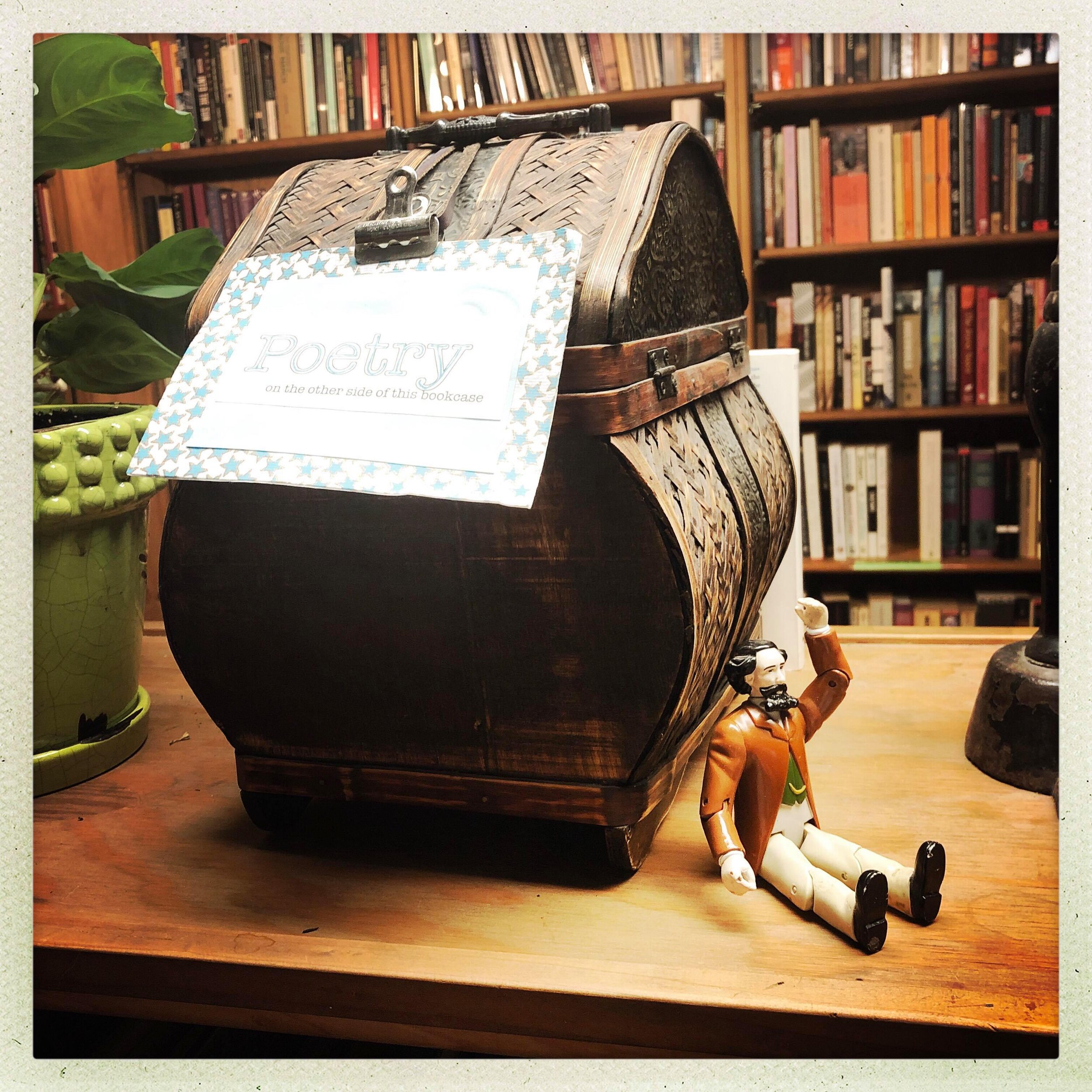
Ophelia’s Books has a vintage charm, and is a strange mix of interesting artefacts, books and a cat

Contextual inquiry
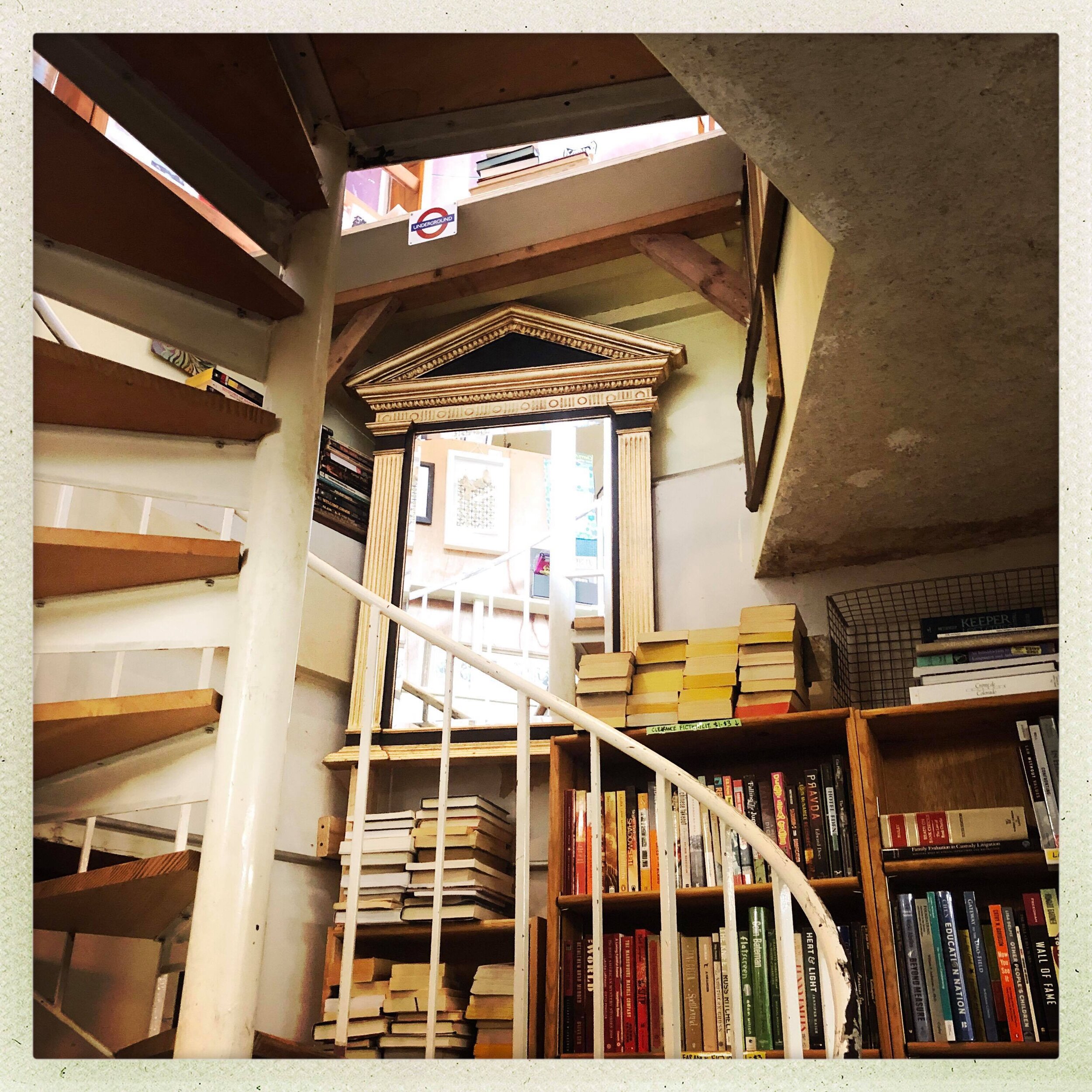
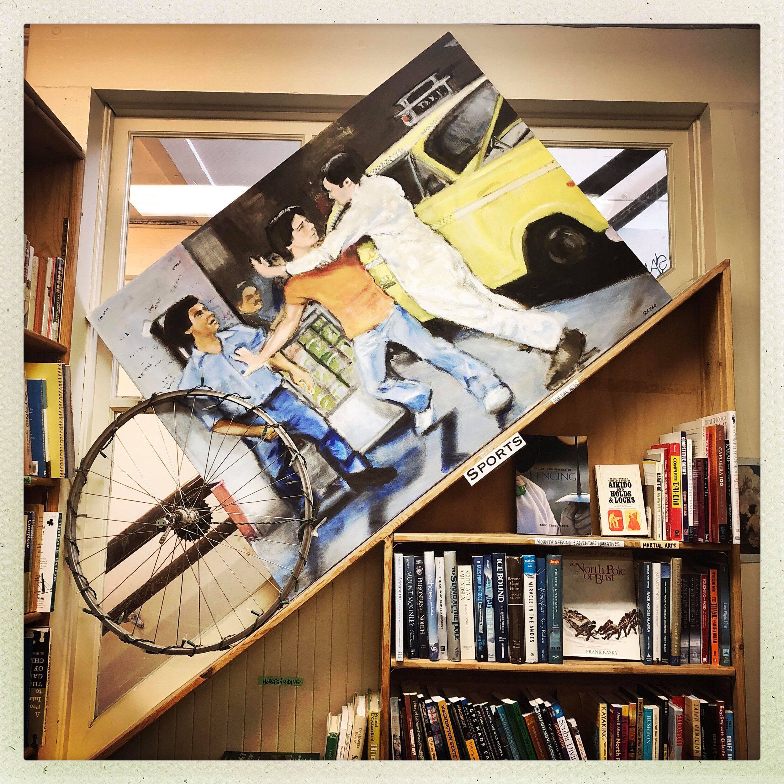
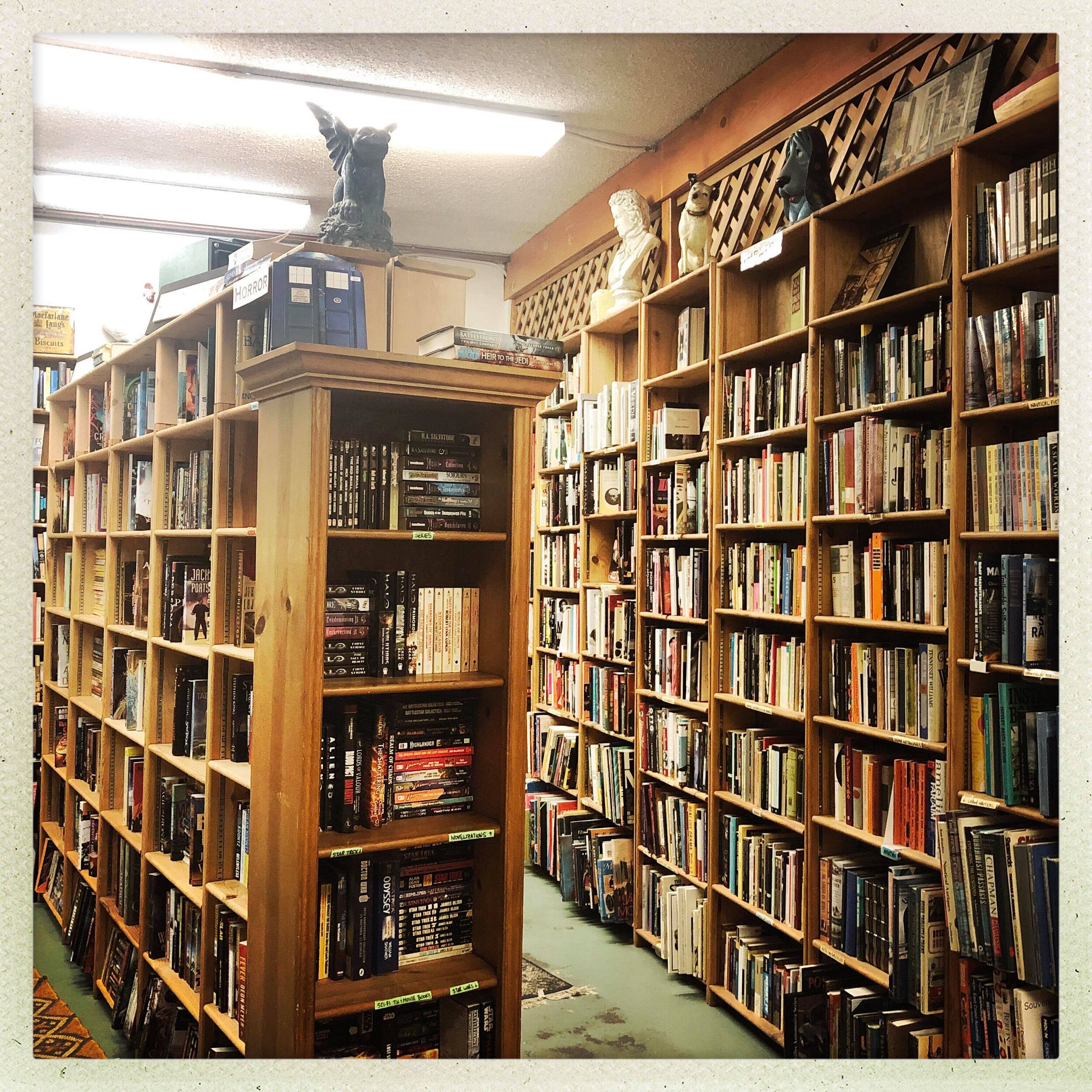
During the visit to the store, I first observed the space. It is small, densely packed with books and spread across three levels, with steep stairs leading to the basement.
The shop has map which tells the users where they can find certain book genres. Upstairs there is a charmingly quaint seating section with some interesting artefacts.
Claudia
As soon as I sat down I was greeted by Claudia, the store cat.
I observed Claudia interact with customers and created the Flow Model to show the level of interaction with the customers.


Flow model of Claudia’s interaction with customers

Interesting objects
There are many obscure, vintage artefacts around the shop, often strategically placed.
It gives the shop a certain feel, like a cave full of wonders.
“ Loved it. First time here and I almost cried, as it reminded me of childhood adventures, fun games and nostalgic memories...”
After gathering insights from online reviews and interviews, several key insights emerged.
Insight 3
Claudia is a much loved heroine

Everyone’s friend
During the interviews and text analysis of the online review and their facebook page, it became clear that Ophelia’s unique selling point is Claudia. Customers expressed much love for her and to some she offered solace.
“Before the object of my search can begin, I am enthusiastically greeted by the resident bookshop cat, who arrives bounding down the mezzanine stairs, in full voice. No bookshop worthy of the name should be without its resident cat. The cat and I continue our conversation, she offering her thoughts on the day and her life in this splendid space, I offering my appreciation of it and of her. In each others company, we wander. ”
Claudia is even famous on the other side of the globe…

Insight 4
Discovering cool books is delightful

Customers reported that they liked unpredictable assortment of books as it allowed them to discover things they would not buy otherwise. Jill, the store owner was also praised for being knowledgeable and recommending good books.
Customers also liked that the bookshop had many clearly marked zones, which helped them browse.
“If I even wanted to find something I didn’t know I wanted and stumble upon something inspiring, I would go there.”
Insight 5
Keeping used book stores alive because they are treasure troves of mystery
Good atmosphere that feels like ‘home’
Many customers felt keeping local, independent used book stores in business was very important. It made them feel good and they felt places like that have certain charm which larger stores did not have.
“What’s not to love about a used bookstore? Less and less of them. I suppose we all know why. Seldom to go here and leave empty handed.”

While talking to interview participants, many mentioned they come here because of the great atmosphere and because they like the idea of their local bookshop, where they can escape for a while and get lost in trying to find a good book.
Designing the website
Content strategy
Since competitor analysis findings pointed to the fact that many small bookshops struggle to keep up with complex websites, the key goal was to design a simple website that would convey the charm of the physical store but also allow customers to check inventory online.

Research insights provided a good base for developing content strategy for the website
I created personas based on the research, to help with the design process.
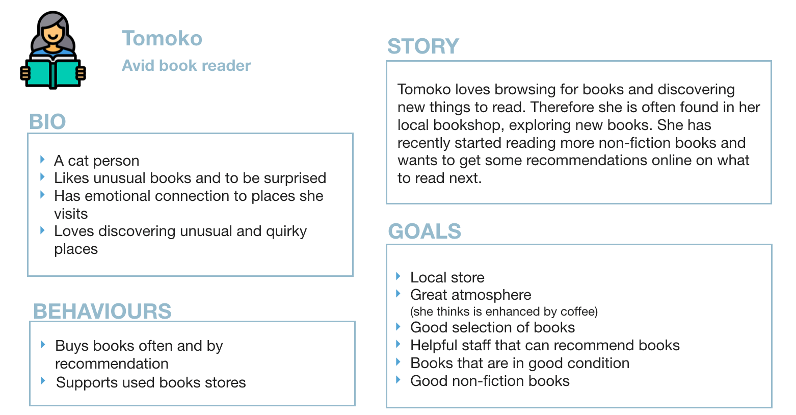
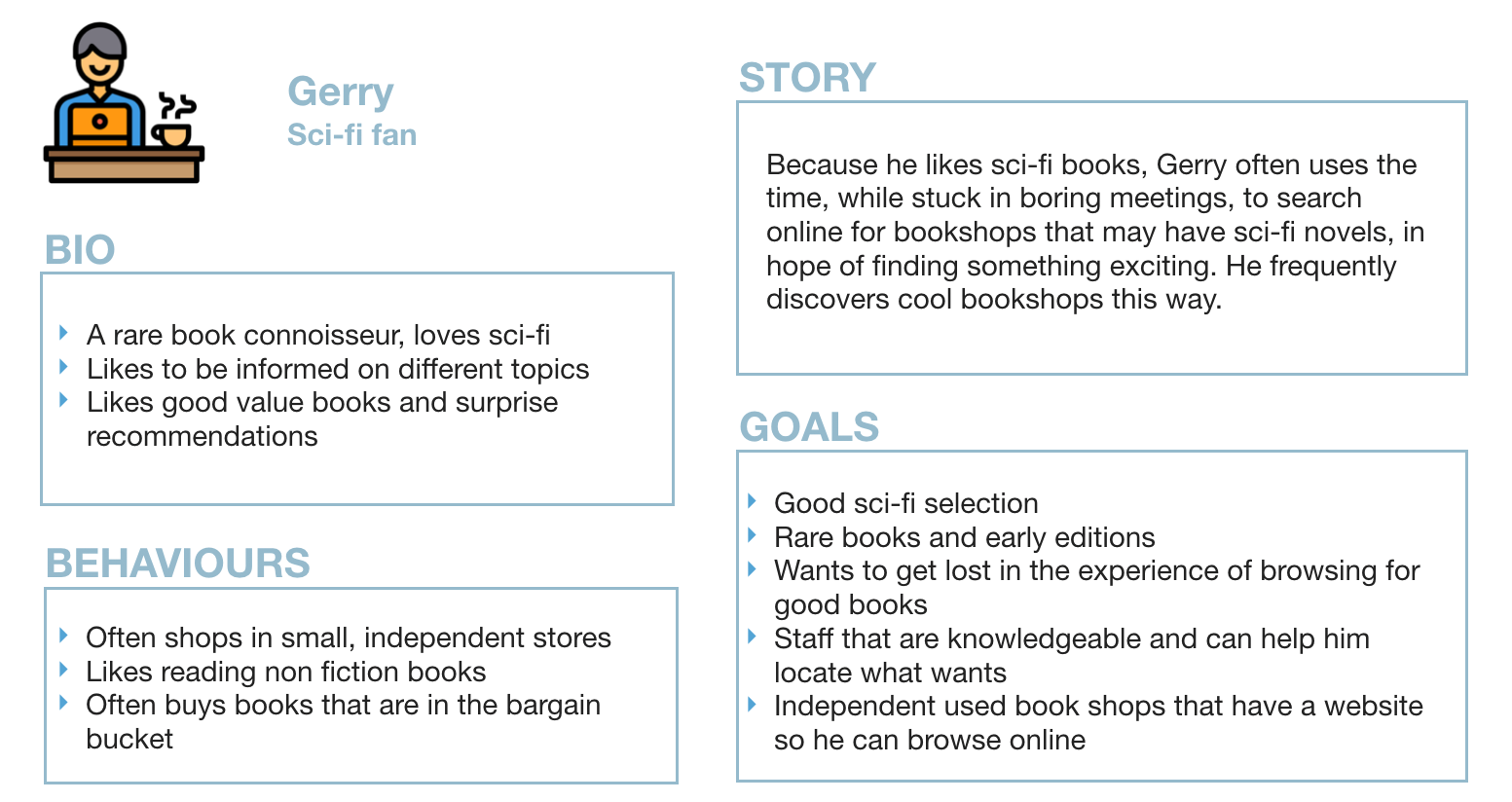
Giving customers the website they want
Research and content strategy identified that users want functionality, discoveries and ‘the feels’.

The website would have Categories of books to buy as well as a Recommendation page where customers can get personal recommendations they would get in the store.
An About section would have nice visuals, capturing some of the magical atmosphere customers love so much and hopefully entice new customers who stumble upon the website by chance
Card sorting provided proof that the intended categories make sense to users.
Since so many customers love Claudia, it was important to make her a prominent feature on the website
I did this in couple of ways:
Adding a Claudia photograph placeholder on the home page
Adding a prominent section on the About page - customers can send their photos of Claudia and a short messages which could be featured
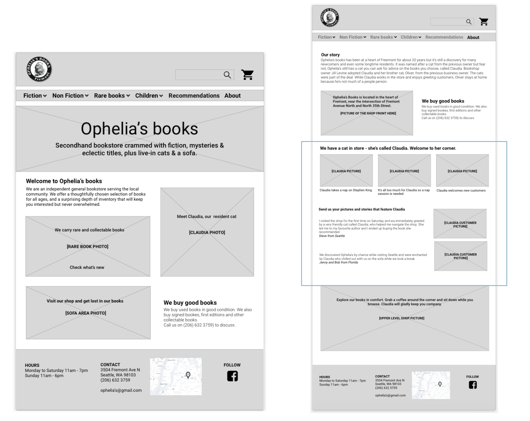
Customers were already sharing Claudia stories in online reviews, this feature would allow customers to have a more personal relationship with the store (and the cat) they love.
User testing the website
I made a prototype and tested it with users, to see if the website was easy to use and if the content makes sense. All the users were unfamiliar with the store.
Users were given two tasks:
To find a specific book, buy it and choose pick up in store
To find out more about the bookshop where they will be picking the order from
I felt that these two tasks would give me all the information needed.
1. Does the website structure makes sense and can users easily purchase the books and choose
delivery options?
2. Do users notice the informational content about the store, such as that it has a resident cat and
that customers can send their pictures in?

I noted, for each participant, if they completed the tasks, number of errors, what went well and any feedback they offered on the website. I also calculated System Usability Score (SUS) and Post Task satisfaction score (SEQ). Since the website was very simple and so were the tasks, I had participants complete one SEQ questionnaire after both tasks.
Findings and iterations
All participants managed to complete the tasks with only few errors
All participants tried search option first - when looking for a particular book, this seems
to be the easiest path for most usersOne participant struggled with categories
Confusing wording identified in some places
It was suggested that Claudia’s content be moved up the page to be more prominent as
participants liked this content

Is it easy and is it usable?
SEQ score of 6.3 indicates the tasks very easy for majority of participants
SUS score of 91.9 indicates that system usability is excellent
I iterated the design, according to user feedback by removing confusing wording, moving Claudia content up to become more prominent. Since only one participant struggled with categories and the card sort indicates that categories make sense, this was left as is.
Mood board

While doing this research, it became apparent that Ophelia’s bookstore is a much loved haven for many people trying to escape the mundane things or their own sorrows.
It’s eclectic collection of books and artefacts offers a unique, quaint charm, therefore the website should reflect this.
I did not go as far as visual design for this website but decided to create a mood board to capture some of the atmosphere of the actual store. This could be used by a visual designer to create a website that would reflect the quirkiness and the atmosphere of the actual store.

Recap
Ophelia’s Books website was simple and dark, not really capturing the unique and quirky charm of the “favourite'“ Fremont bookstore.
I conducted competitive analysis and a contextual inquiry and started with a problem statement:
How might I design a website that conveys the same simplicity, charm, quirkiness and atmosphere of Ophelia’s Books store?
Throughout design process, I had one objective in mind: to create a simple, yet impressive website that would capture the special charm of Ophelia’s Books store. A website that will be easy to maintain, but which would, hopefully, delight a returning customer as well as a potential new one alike.
I feel I achieved this through keeping it simple and by creating an exciting ‘About’ page which captures Ophelia’s Books unique atmosphere.
Credits and copyright
Icons made by Itim2101 from www.flaticon.com
Photographs: © Martina Dove, 2019